

Rather than provide yet another typical post on K-means clustering and the “elbow” method, I wanted to provide a more visual perspective of these concepts. Also, I included the Python code below in case you’d like to run it yourself.
[Also, perhaps the purpose of this blog could be to make machine learning concepts more easily understood.]
K-means clustering is a general purpose clustering algorithm. According to Wikipedia, K-means clustering can be used for “market segmentation, computer vision, geostatistics, astronomy and agriculture”. In addition, I’ve used it on unstructured text to group similar review comments. K-means clustering does a fairly decent job but has a few drawbacks that I mentioned in my prior post on clustering unstructured text.
Centroid
A cluster consists of data within the proximity of a cluster center. There can be 1 or more cluster centers each representing different parts of the data. Below, there’s just 1 cluster center to represent the 5 surrounding data points.
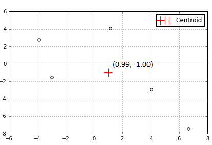
One type of cluster center is called a centroid. A centroid is just the mean (average) position of all points in a cluster, hence the phrase K-means or K number of means.
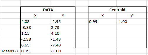
Our data table below represents the dots and centroid above. If we calculate the mean of each X and Y column coordinates we get the centroid that has been calculated in our program below.
Elbow method
The K-means algorithm requires the number of clusters to be specified in advance. One popular method to determine the number of clusters is the elbow method.
The elbow method simply entails looking at a line graph that (hopefully) shows as more centroids are added the breadth of data around those centroids decreases. In this case, the breadth of data is called distortion or sum of square errors (SSE). Distortion could decrease rapidly at first then slowly flatten forming an “elbow” in a line graph. I use qualifiers “hopefully” and “could” because the results really depend on your data.
Let’s generate slightly bigger clusters and look at some visuals to make sense of this explanation.
We’re going to use a 2-d graph to visualize the concepts below. K-means can be used with far higher dimensions, however they can be difficult to visualize.
k-means functions as follows:
- k-means picks random starting centroids among the data
- each data point is assigned to the nearest centroid. [If you choose 3 clusters in advance then you’ll get 3 centroids with random starting locations.]
- the centroids move until they’re at the center of the assigned data points
- 2 and 3 above repeat until the centroids don’t change, a user defined tolerance is achieved or the maximum iterations are reached (see max_iter in the code below for maximum iterations).
The graphs below show the final centroid(s) after the above has been completed. A good visualization showing centroids moving around to determine their final location can be found here.
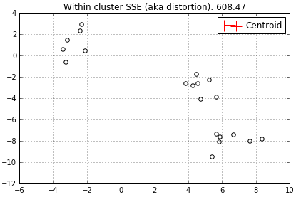
At the top of each graph I added the distortion. You’ll note that the distortion above is rather high at 608.47 because we only have 1 centroid trying to represent all surrounding data.
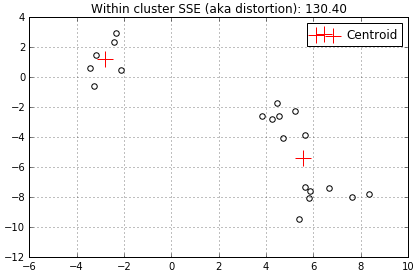
When another centroid is added the distortion decreases to 130.4 because 2 centroids have less data to represent.
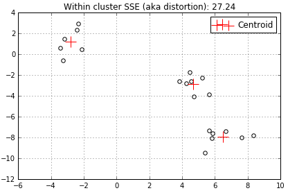
…and another centroid decreases the distortion even further to 27.24…
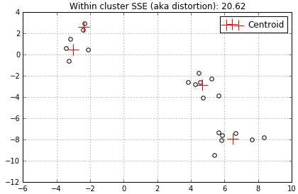
…add a 4th centroid…
…and finally the 5th centroid (I simply chose to stop here).
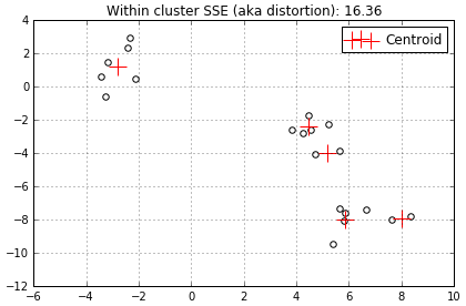
In this example the distortion started out fairly high then decreased rapidly as we added centroids. Although, when we added the 4th and 5th centroids the distortion decreased much less, from 27.24 to 20.62 to 16.36. The best way to visualize this progress is to use the line graph I mentioned earlier. All distortions mentioned above are shown on the line graph below.
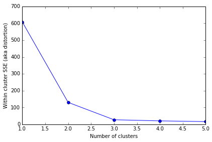
The X axis is the number of clusters with a centroid. The Y axis represents the distortion across all clusters. The elbow is obviously at 3 since the line flattens out after that point. In this case 3 is the optimal number of centroids to use to represent this data.
Distortion
You may be wondering “what exactly is the distortion?”. The distortion is the sum of square errors (SSE) – that’s 3 things that need to take place; determine the error, square it, then finally take the sum.
The “error” in this case is the difference between each data point coordinates and the centroid coordinates.
The SSE is simply:

All we’re doing is:
– taking the difference between each data point and a centroid
– squaring that difference
– and summing it all up!
To put this equation into action we’ll use the same data shown earlier.
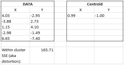
Below, I bolded the centroid X and Y coordinates to show the pattern.
(4.03 – 0.99)^2 + (-2.95 – -1.00)^2 + (-3.88 – 0.99)^2 + (2.73 – -1.00)^2…
Continue by matching each Data X and Y value to their corresponding centroid X and Y values, sum it up and you’ll get the within cluster SSE or distortion. In Python this value can be retrieved using the Kmeans.intertia_ variable (the full code example is below).
All code below is for illustrative purposes only and is unsupported.
Note: You’ll need to indent the code under the “for cluster_count…” since the editor removed the tabs.
I hope this post made the K-means and the elbow method easy to understand. Drop me a comment below! [:]-)
# -*- coding: utf-8 -*-
“””
—–
Part of the code below was borrowed from Sebastian Raschka.
Here is the copyright notice:
The MIT License (MIT)
Copyright (c) 2015, 2016 SEBASTIAN RASCHKA (mail@sebastianraschka.com)
Permission is hereby granted, free of charge, to any person obtaining a copy
of this software and associated documentation files (the “Software”), to deal
in the Software without restriction, including without limitation the rights
to use, copy, modify, merge, publish, distribute, sublicense, and/or sell
copies of the Software, and to permit persons to whom the Software is
furnished to do so, subject to the following conditions:
The above copyright notice and this permission notice shall be included in all
copies or substantial portions of the Software.
—–
Goal:
Visually show how the elbow method works.
Show each newly created centroid on a 2-D chart.
Show the inertia_ for each centroid.
“””
from sklearn.datasets import make_blobs
import matplotlib.pyplot as plt
from sklearn.cluster import KMeans
# Constant used several times below.
NUM_CLUSTERS = 3
# Create the test data. Only the data in X is used.
X, y = make_blobs(n_samples=20,
n_features=2,
centers=NUM_CLUSTERS,
cluster_std=0.9,
shuffle=True,
random_state=44)
# Cluster scatterplot without centroids.
plt.scatter(X[:, 0], X[:, 1], c=’white’, marker=’o’, s=30)
plt.grid()
plt.tight_layout()
plt.show()
print(“\nNOTE: Each centroid below is the final one chosen after k-means runs max_iter times.”)
savedInertia = []
# Loop through max number of clusters. Add a few additional clusters
# beyond the constant specified so the elbow can be seen.
for cluster_count in range(1, NUM_CLUSTERS+3):
# BEGIN INDENT HERE…
km = KMeans(n_clusters=cluster_count,
init=’random’,
n_init=10,
max_iter=200,
random_state=0)
km.fit(X)
# Save the distortion for each final cluster chosen by KMeans above.
savedInertia.append(km.inertia_)
# Show the dots.
plt.scatter(X[:, 0],
X[:, 1],
c=’white’,
marker=’o’,
s=30)
# Show the Centroids.
plt.scatter(km.cluster_centers_[:, 0],
km.cluster_centers_[:, 1],
s=250,
marker=’+’,
c=’red’,
label=’Centroid’)
plt.title(“Within cluster SSE (aka distortion): %.2f” % km.inertia_)
plt.legend()
plt.grid()
plt.tight_layout()
plt.show()
# END INDENT
# Plot the line graph with the elbow.
plt.plot(range(1, NUM_CLUSTERS+3), savedInertia, marker=’o’)
plt.xlabel(‘Number of clusters’)
plt.ylabel(‘Within cluster SSE (aka distortion)’)
plt.tight_layout()
plt.show()
